I’m Vinicius Sueiro — a designer using technology to inform & delight humans
Sometimes that means I’m a front end developer an interaction designer a data visualization developer an information designer a software engineer a university lecturer a web developer a data visualization consultant a creative technologist a product designer

With over 12 years of experience, I’ve designed and developed data-driven projects for clients like Google, the Washington Post, and the World Health Organization.
My work has been awarded the “Best in Show” 🏆 by SND , among 1,700 entries worldwide – as well as the best data visualization in Latin America by WAN-IFRA Digital Media Awards.
I was also a judge for Brasil Design Awards 2021 and Information is Beautiful Awards 2023 and 2024.
In early 2022, I started teaching. First, at graduate programs in Brazil. Then, for 3 years, I was a full-time lecturer at the University of Miami, where I taught coding, design, and data visualization.
I’m currently building the Open Visualization Academy, a free platform for learning about data, design, coding, ethics, AI, and more.
On the technical side, I enjoy learning new job-specific tools. But here are my all-time favorites:
- JavaScript
- CSS
- HTML
- Python
- Svelte
- Git
Below you’ll find some of my data-driven projects — as well as a cute dinosaur if you scroll all the way down. 🦖
-
Google & Lupa — 2020
Humanizing Covid‑19 Data
By simulating what would happen if all Covid‑19 deaths in Brazil happened in your neighborhood, “No Epicentro” tries to humanize an evergrowing number
Learn moreScreen-recording of the mobile version of the website, after a user entered an address. The main visual of the interface is a black map with white dots (each dot represents one death), displayed in a huge circle around the user’s location. -
Master’s Thesis — 2021
Digging a Hole Through Earth
SuperTunnel is an educational tool that simulates a hole through Earth, indicating where in the world you would end up if you dug in a certain direction
Learn moreBesides playing with the desktop version of the SuperTunnel Simulator, people could interact with a physical shovel (a tangible interface) to control the direction of the tunnel – as part of an installation in science museums. -
Personal — 2025
Lead Tracker for NBA games
This 3D data visualization shows every moment a basketball team was leading or trailing during a season — explore every play from a different angle
Learn moreThis data visualization shows every moment a team led (blue) or trailed (red) during the 2024–25 NBA season. The 3D chart maps game flow across all quarters and overtimes, highlighting win/loss trends and peak score differentials. Based on data from Basketball-Reference.com. -
Estadão — 2019
Child Adoption Simulation
A story on how age & disabilities impact a child’s likelihood of being chosen by a foster parent, using growing plants as a visual metaphor
Learn more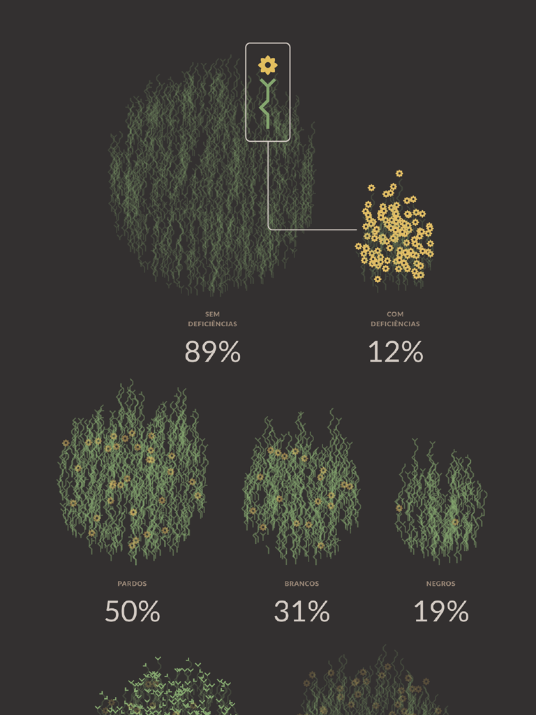
Desktop and mobile version of an interactive chart that represents children as tiny plants, that grow as time passes – while they wait for a new parent to adopt them. These plants are also grouped by categories such as ethnicity, siblings and disabilities. -
Personal — 2017
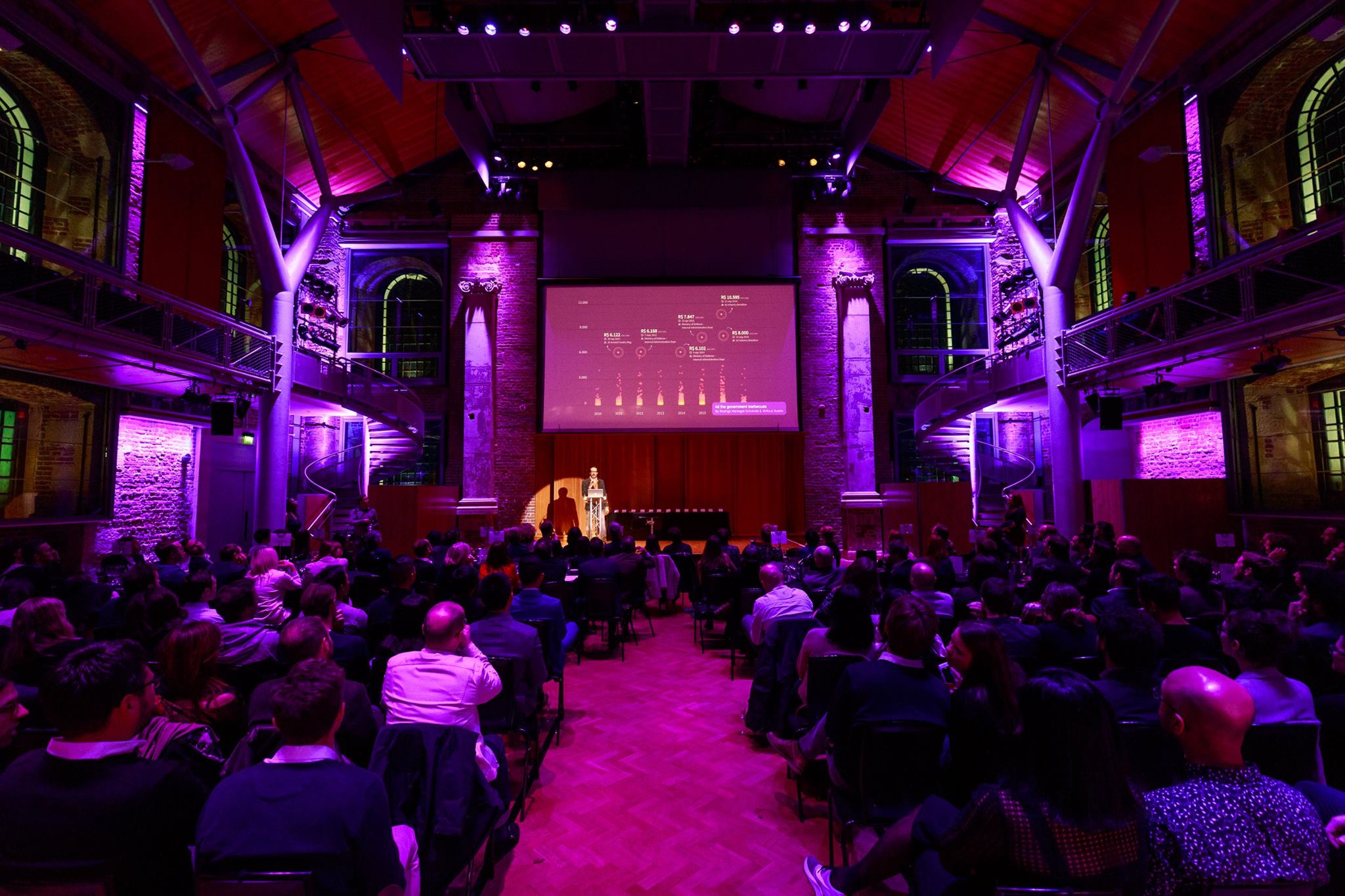
Government Barbecues
Thousands of overpriced meals were purchased by the Brazilian government with public money. This fiery chart shows them all
Learn moreDesktop version of website design for data journalism news article focused on government expenses on barbecues. -
Estadão — 2019
FaceApp’s Racial Bias AI Experiment
After applying the aging filter 5× on the same photos, all faces were whitened, indicating racially biased dataset was used to train the app’s AI
Learn more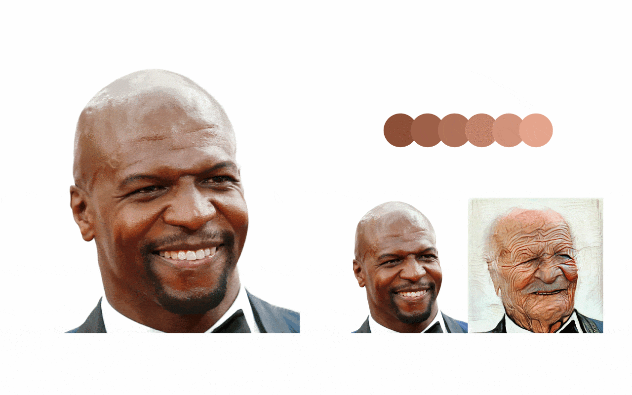
A visual composition showcasing black actor Terry Crews as an animation: from his original photo, then to the result of the first image filter, then to the second, and so on. The result is a looped animation in which his face gets more white after each filter (and also extremely distorted by excessive wrinkles). -
Estadão — 2017
Delivering mobile-ready infographics
Uva is an in-house tool for publishing responsive graphics, seamlessly embedded in news articles, reaching 30M+ readers within 2 years of launch
Learn more -
World Health Organization — 2021
Explaining Covid‑19 Vaccination Benefits
With illustrated analogies & a friendly conversational tone, this series of social media videos try to explain why vaccination is important
Learn moreA social media post simulates a chat between a person and WHO. It explains why vaccination is important to prevent hospitals from being overwhelmed, which leads to people (Covid-19 patients, but also other patients) being left untreated. To explain that, the video uses an analogy of a cup (representing the capacity of a hospital), which is overflown with colored balls. Every ball represents a patient. Those who fell outside of the cup represent patients who were not able to get treatment due to overcrowded hospitals. -
Personal — 2024
Tracking SHEIN’s Composition Labels
Using automated data collection and analysis, we feature fast fashion’s top biodegradable clothes, focusing on natural fibers like cotton, viscose & linen
Check it live… -
Personal — 2019
Eco‑Friendly Dinosaur Toys
“Montadino” is a concept initiative for crafting toys from reused EVA foam, which is largely used in schools and often goes to waste
Learn more
Animation where a cute T-Rex (toy in red) is mounting a Brontosaur (toy in brown), which sucumbs to the T-Rex weight. The dinosaur on top keeps moving his head in loop – as if trying to understand the situation.
Get in touch
Thanks for scrolling all this way! Now, feel free to send me an email about your ideas and how we might work together to make them happen.