Humanizing Covid‑19 Data
What if all Covid‑19 deaths in Brazil happened in your neighborhood?
- 🏆 Best in Show (small teams) at SND
- 🥇 Best dataviz in Latin America at WAN‑IFRA
- 📡 Featured on prime-time TV at Rede Globo
Overview
In early 2020, when the first deaths related to the new coronavirus began to take place, we kept on hearing about those losses on the news – often with a heavy heart.
However, as the number of people losing their lives kept on increasing, our compassion towards those victims got dramatically reduced.
Such effect is often defined as quantitative numbing, which refers to a specific scenario of psychic numbing, a well-documented phenomenon.
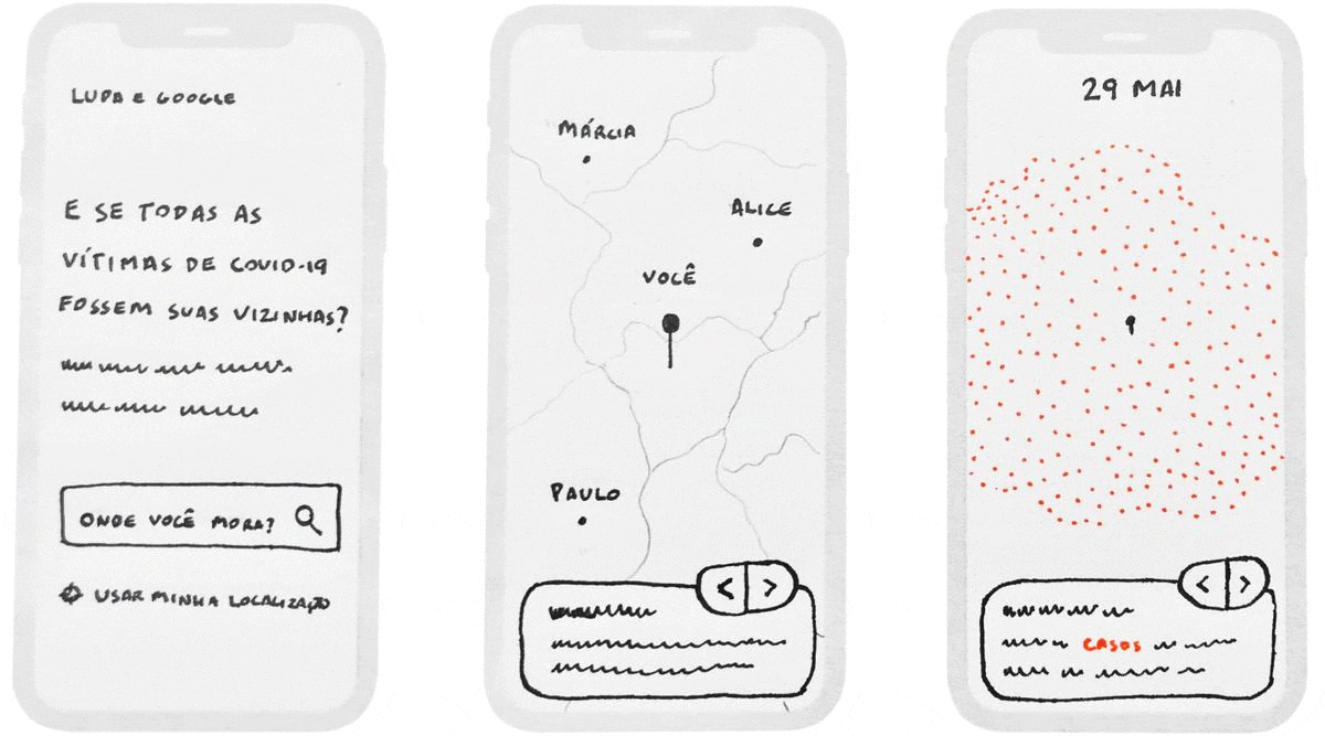
In order to fight back our indifference to the suffering of thousands of people, “At the epicenter” tried to place those numbers into a more human scale: our neighborhoods.
The project began when Natália Leal, CEO of Agência Lupa, realized we needed a more emotional way of communicating the massive numbers of the pandemic.
After putting together a team of 3 freelancers (myself included), we pitched the idea to Google News Initiative – that would provide funding, as well as Alberto Cairo’s creative direction.
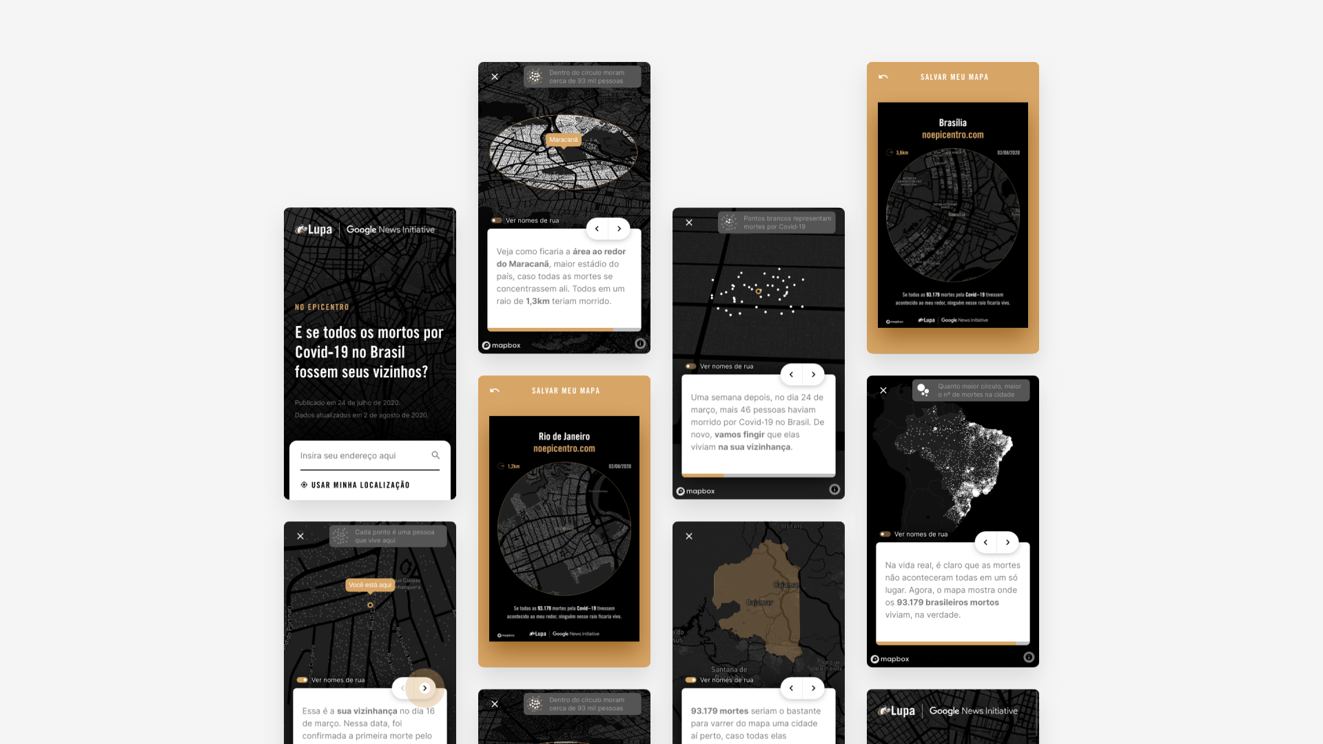
During the next 2 months (and after several prototypes), this tight-knit collaboration had resulted in a full-fledged web application, which was published on July 24, 2020.
I was mainly responsible for the visual design and front end development of the website (using HTML, CSS, and pure JavaScript). In other words, I basically used coding to bring these screens to life:
Outcomes
One week after its launch, “At the epicenter” had more than 210,000 page views. Among those, 178,000 were unique users. But the most remarkable indicator is that those people spent, on average, 10 minutes and 54 seconds browsing the website — way above market average.
- 200k + Views
- 10 min + Duration
On top of that, people really dove into the story: for every 100 people who began the narrative experience, 71 reached the end of it.
I believe this high engagement is related to how unique the experience is for each user: after being prompted to enter their own address, users would see graphics and texts generated based on their geographic location.
The main chart draws a circle around the user’s location, representing a radius of devastation. That circle is, then, filled with white dots, each one representing a death.
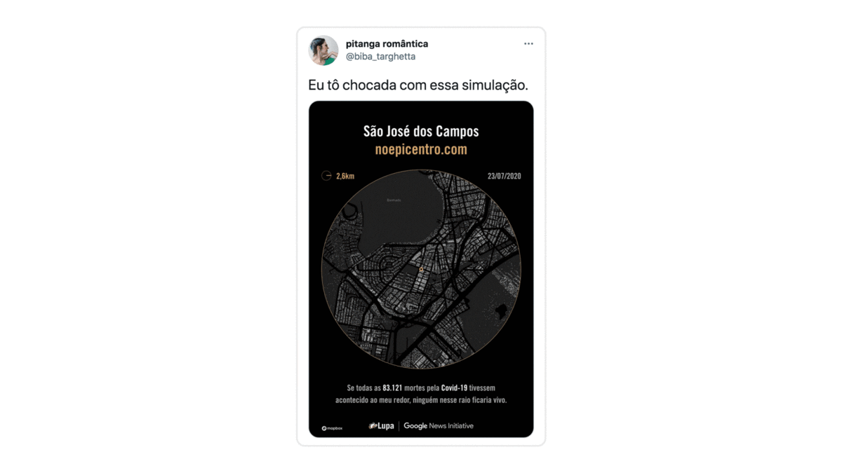
Users could also download their own map as a custom
.jpg poster, to be shared on social media, as showcased below (along with other written
testimonials):
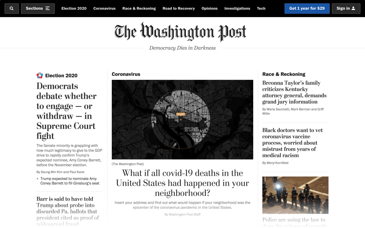
That sort of impact motivated The Washington Post into launching a U.S. version of “At the Epicenter”, also in a partnership with Google News Initiative.
After we collaborated with a team of editors and developers from the Post, their version was published on September 26, 2020.
Here’s what their homepage look like that day:
In 2021, the Brazilian version of the project was awarded “Best in Show” by SND, among over 1,700 entries worldwide, in the small teams category.
Besides applauding the clear narrative, judges also praised the story for providing a sense of scale regarding a statistic that people thought they already understood.
On a personal level, another judge wrote:
For me, the dots became more than a face in a crowd in a distant city — they became every single one of my neighbors, the children playing in the street, the mail person, and my parents.
Judge, Society for News Design
The story was also featured on TV, both live at CNN (in Portuguese), as well as during Fantástico, the most watched show on Sunday nights in Brazil.
In case you are not afraid of technical terms (and lengthy articles), you can learn about our creative process on this behind-the-scenes piece, translated and published by the Global Investigative Journalism Network.
My Role
- UX/UI Design
- Front End Development
- Metrics Implementation
Some of the people that made this project happen include Rodrigo Menegat (data & storytelling), Tiago Maranhão (development) and Vallery Victoria (design).