Explaining Covid‑19 Vaccination Benefits
With illustrated analogies & a friendly conversational tone, these short videos try to explain why vaccination is important
Overview
In November of 2021, I began a 4‑month collaboration with the WHO Regional Office for Europe (WHO/Europe) as a Data Visualization Consultant.
As part of the Risk Communication, Community Engagement and Infodemic Management team, my goal was to turn raw technical data into stories and develop data visualizations to illuminate new scientific evidence.
During my time there, I built internal tools, prototyped dozens of charts, and published 2 projects that I want to highlight in this case study:
- Lives Saved
- Chat with WHO (the thumbnail one)
Outcomes
The deliverables for both those projects were short animated videos for social media – but here you’ll also see some behind-the-scenes, like early sketches and prototypes.
Lives Saved
I created animated charts and diagrams to communicate findings from a study by WHO and ECDC (European Centre for Disease Prevention and Control) that estimated over 470,000 lives had been saved by COVID‑19 vaccination – in people over 60 years old – throughout the European Region.
The final infographic looks nothing like the early prototype below, built in Observable ↓
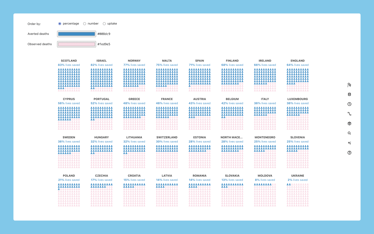
It was actually my first time using “Observable JavaScript” – and sharing its interactive notebooks with the team was great for testing, as members could play with different settings, colors, and filters.
We ended up ditching the small multiple approach with waffle charts, as it was too detailed.
The solution? A simple chart describing 2 scenarios: how many people would have died with and without vaccination.
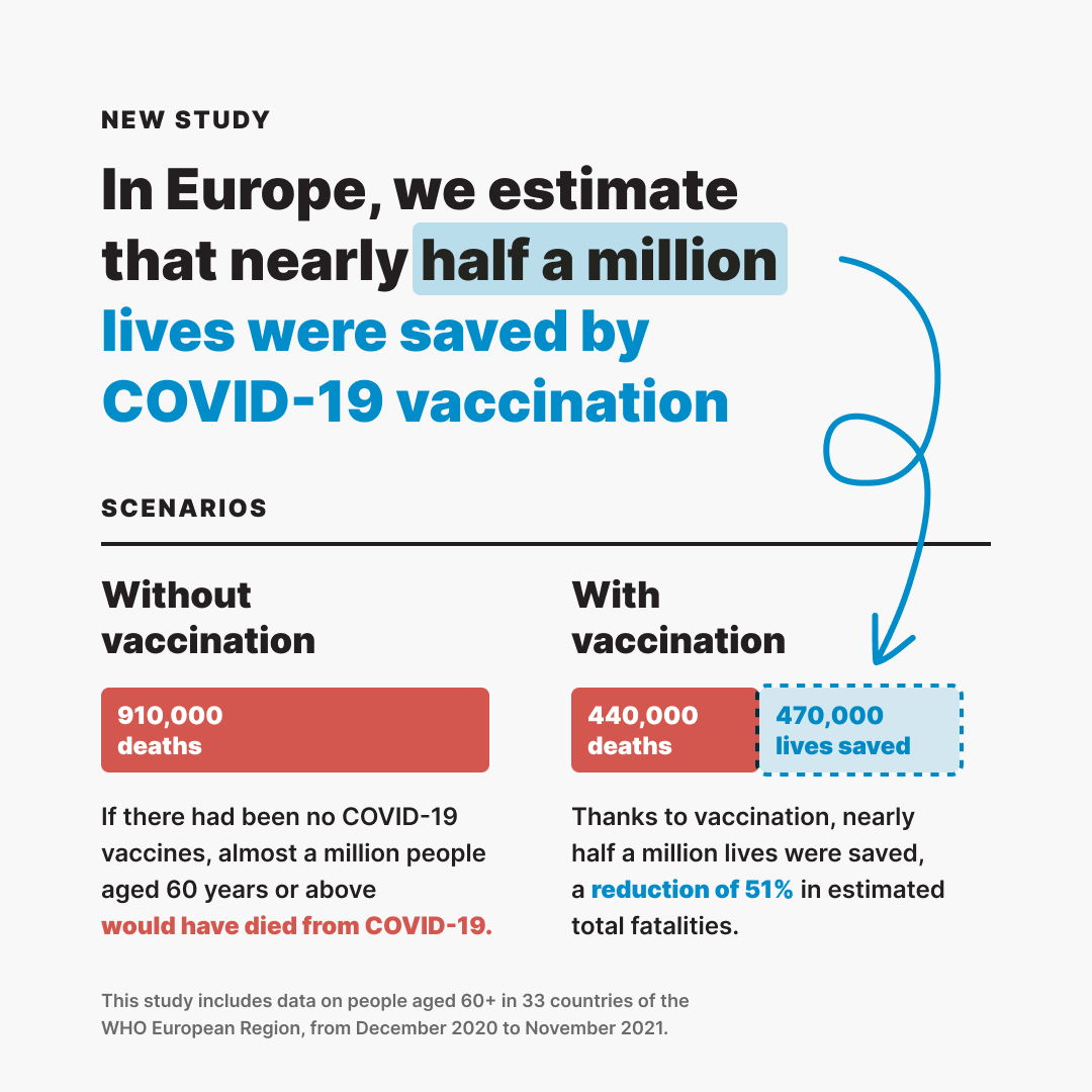
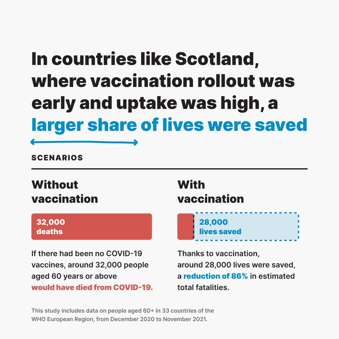
This project has been viewed over 3 million times on social media and was even shared on Twitter by then First Minister of Scotland, Nicola Sturgeon.
Chat with WHO
I also created a series of 2 videos with animated graphics to explain the benefits of vaccination and protective measures against COVID‑19.
The idea was to simulate a conversation between a person and WHO, using analogies to convey the message. 💬
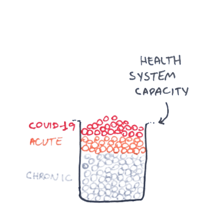
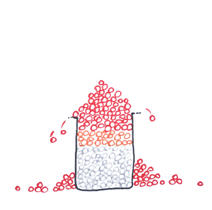
In the final version, the overflowing circles are not all red. Instead, they are of different colors, meaning not only COVID‑19 patients would be left untreated, but also any other patients who needed care.
Another video in this series was about additional protective measures, like wearing a mask. It illustrated how protecting yourself could prevent transmission – and protect countless others.
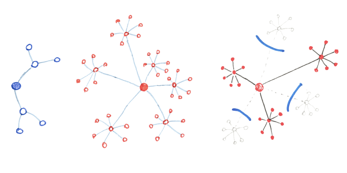
The starting point for visualizing the spread of the disease was exactly that: a starting point.
Considering that dot on the center, represening 1 person with COVID‑19, transmits the disease to 2 other people, this is what a network diagram could look like, after 5 cycles:
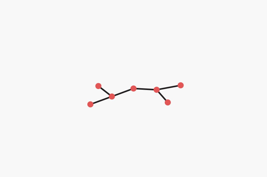
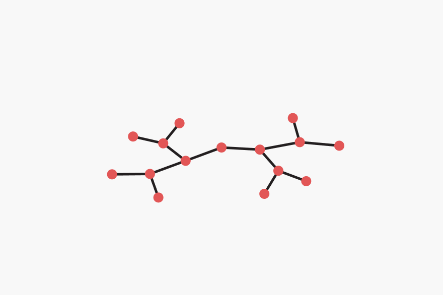
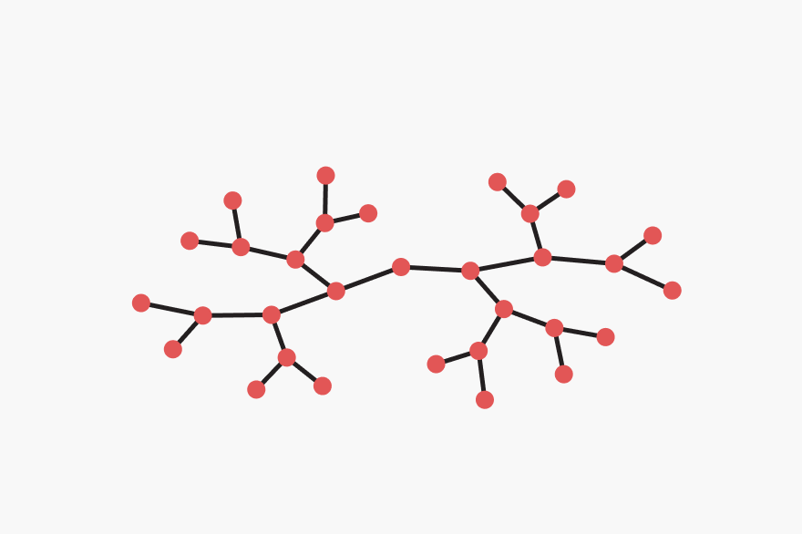
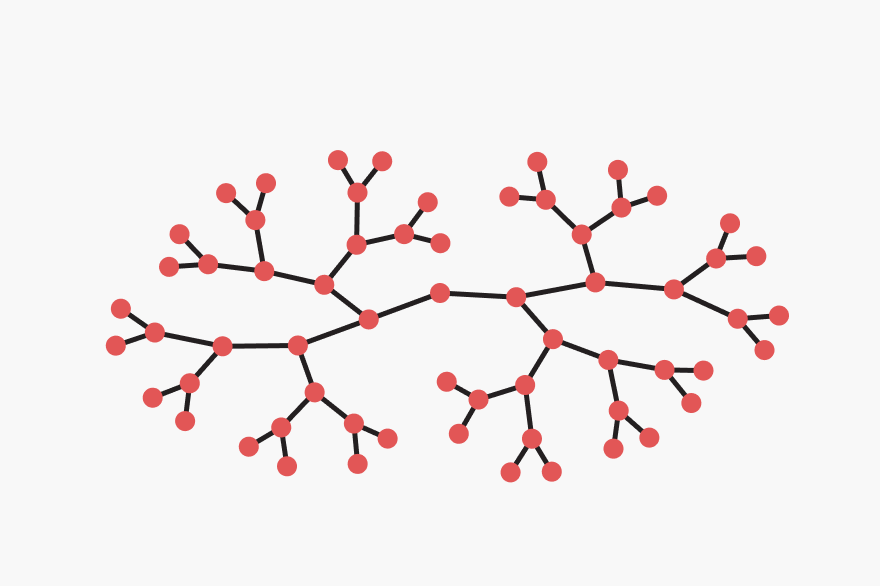


As a side note, I created this network diagram connecting data points that I generated in Python.
Each dot has a unique Source value, and it gets connected to the dots under the
Target column, like so:
| Source | Target |
|---|---|
| 0 | 01 |
| 0 | 02 |
| 01 | 011 |
| 01 | 012 |
| 011 | 0111 |
| 011 | 0112 |
| 0111 | 01111 |
| 0111 | 01112 |
| 01111 | 011111 |
| 01111 | 011112 |
| 01112 | 011121 |
| 01112 | 011122 |
| 0112 | 01121 |
| 0112 | 01122 |
| 01121 | 011211 |
| 01121 | 011212 |
| 01122 | 011221 |
| 01122 | 011222 |
| 012 | 0121 |
| 012 | 0122 |
| 0121 | 01211 |
| 0121 | 01212 |
| 01211 | 012111 |
| 01211 | 012112 |
| 01212 | 012121 |
| 01212 | 012122 |
| 0122 | 01221 |
| 0122 | 01222 |
| 01221 | 012211 |
| 01221 | 012212 |
| 01222 | 012221 |
| 01222 | 012222 |
| 02 | 021 |
| 02 | 022 |
| 021 | 0211 |
| 021 | 0212 |
| 0211 | 02111 |
| 0211 | 02112 |
| 02111 | 021111 |
| 02111 | 021112 |
| 02112 | 021121 |
| 02112 | 021122 |
| 0212 | 02121 |
| 0212 | 02122 |
| 02121 | 021211 |
| 02121 | 021212 |
| 02122 | 021221 |
| 02122 | 021222 |
| 022 | 0221 |
| 022 | 0222 |
| 0221 | 02211 |
| 0221 | 02212 |
| 02211 | 022111 |
| 02211 | 022112 |
| 02212 | 022121 |
| 02212 | 022122 |
| 0222 | 02221 |
| 0222 | 02222 |
| 02221 | 022211 |
| 02221 | 022212 |
| 02222 | 022221 |
| 02222 | 022222 |
You can see that the dot with source 0 (the one in the center of the diagram), is linked to 2 others (01 and 02).
Anyways, this is how the visual narrative turned out:
One cool thing is that these videos were generated from HTML elements.
I naturally used CSS to style them, and JavaScript to make them dynamic (including GSAP for timeline animation and matter.js for physics).
But, essentially, being HTML elements means it’s easy to change the content of the simulated messages – as well as to create versions in different languages.
So, in order to support country-specific teams, I created an automated tool for translating those videos into other languages, like Georgian. 🇬🇪
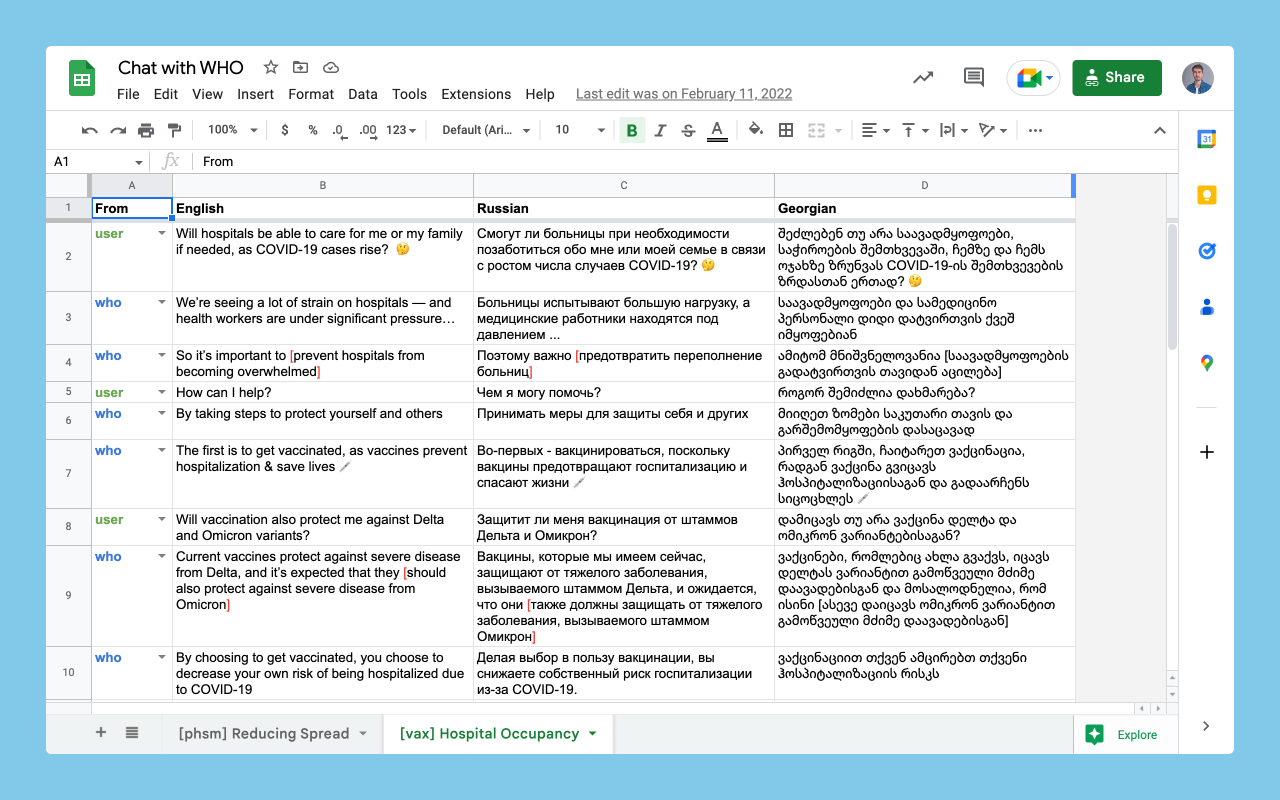
The (human) translator would add the contents of each message in a spreadsheet. The video would then be populated with the translated messages and all animations would be re-generated.
As a bonus, this tool made the whole text editing process (even in English!) very fast and easy – which is useful when editors make constant changes to the narrative.
These videos achieved around 10 million views across social media.
My Role
- Ideation
- Prototyping
- Design
- Development