Government Barbecues
Thousands of overpriced meals were purchased by the Brazilian government with public money
- 🏆 Information is Beautiful Awards winner
- 🎧 Featured in the Data Viz Today podcast
- 🦄 Most beautiful chart of 2017 on Data Curious
Context
A dear friend of mine was specializing in data journalism at the Columbia University J-School in New York City. As a course assignment, Rodrigo Menegat was about to write his first story using Python for analysing data.
Meanwhile, here in Brazil, I was eager to experiment with new ways of communicating visual information.
As you can imagine, we decided to partner up.
Rodrigo was initially astonished by the amount of government purchases that were kept secret – that is, you know how much was spent, but not what was bought.
Although this was interesting, there had to be a more compelling way of putting the word out…
Challenge
- How can we approach a dataset in a way that will make people feel connected to it?
- How can we humanize our numbers?
Solution
You’re probably not very familiar with bidding processes, but you sure know how much a meal should cost.
From a narrative standpoint, this was a cool way of introducing a boring subject.
It was time to get visual.
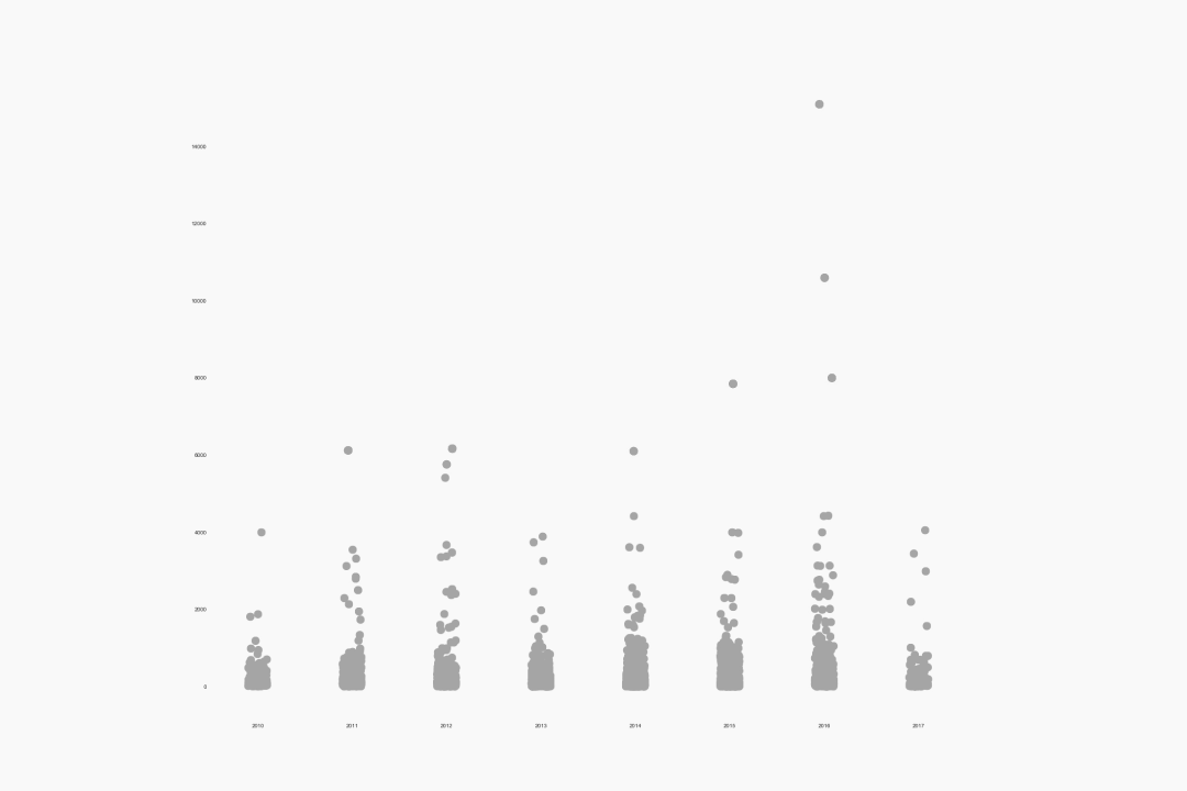
If you like to speak nerdy, the chosen chart type is called jitterplot 🤓 – which is a scatterplot with discrete values on one axis.
Anyways, what matters is that each dot represents a stakehouse dinner bought with public money.
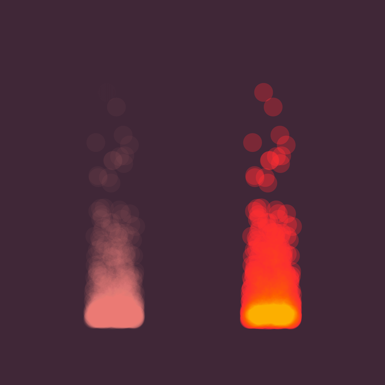
The magic touch was using a blend mode called “soft light” on each dot. Doing so, every overlapping dot became brighter and brighter – which resulted in this fiery look 🔥. Check the effect in action:
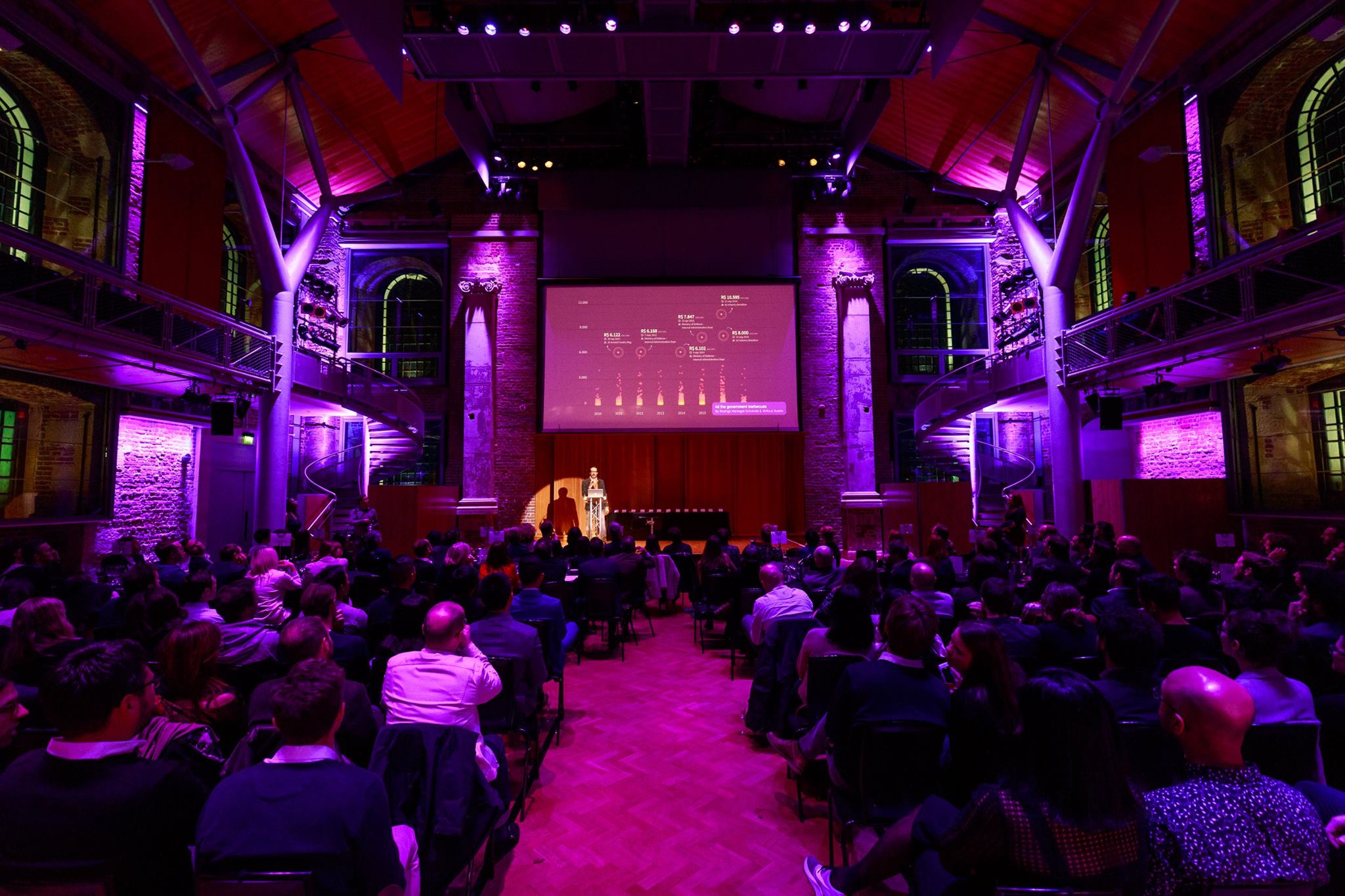
Result
As this visual essay was independently published, it had only been viewed a few thousand times.
On the other hand, these flames were able to generate a tiny buzz inside the dataviz community.
I guess it all started when this project won a medal at the Kantar Information is Beautiful Awards in 2017, in the Best Non-English category.
It also managed to attract some specialized critique:
Designed so cleverly.
Maarten Lambrechts, Data Visualization Consultant
I think my choice for most beautiful chart design goes to this investigative piece on how much the Brazilian government spends on federal barbecues. Combining fiery visuals and flames in a bar chart is genius.
Benjamin Cooley, Curator of Data Curious
It’s funny because this project was also featured on the Data Viz Today podcast by Alli Torban and, to be honest, it’s almost like she understood this project better than the people involved in it.
If you have a few minutes, I highly recommend listening to her show – in which she breaks down projects from around the world and provides actionable tips from the lessons learned.
Feel free to hit play: