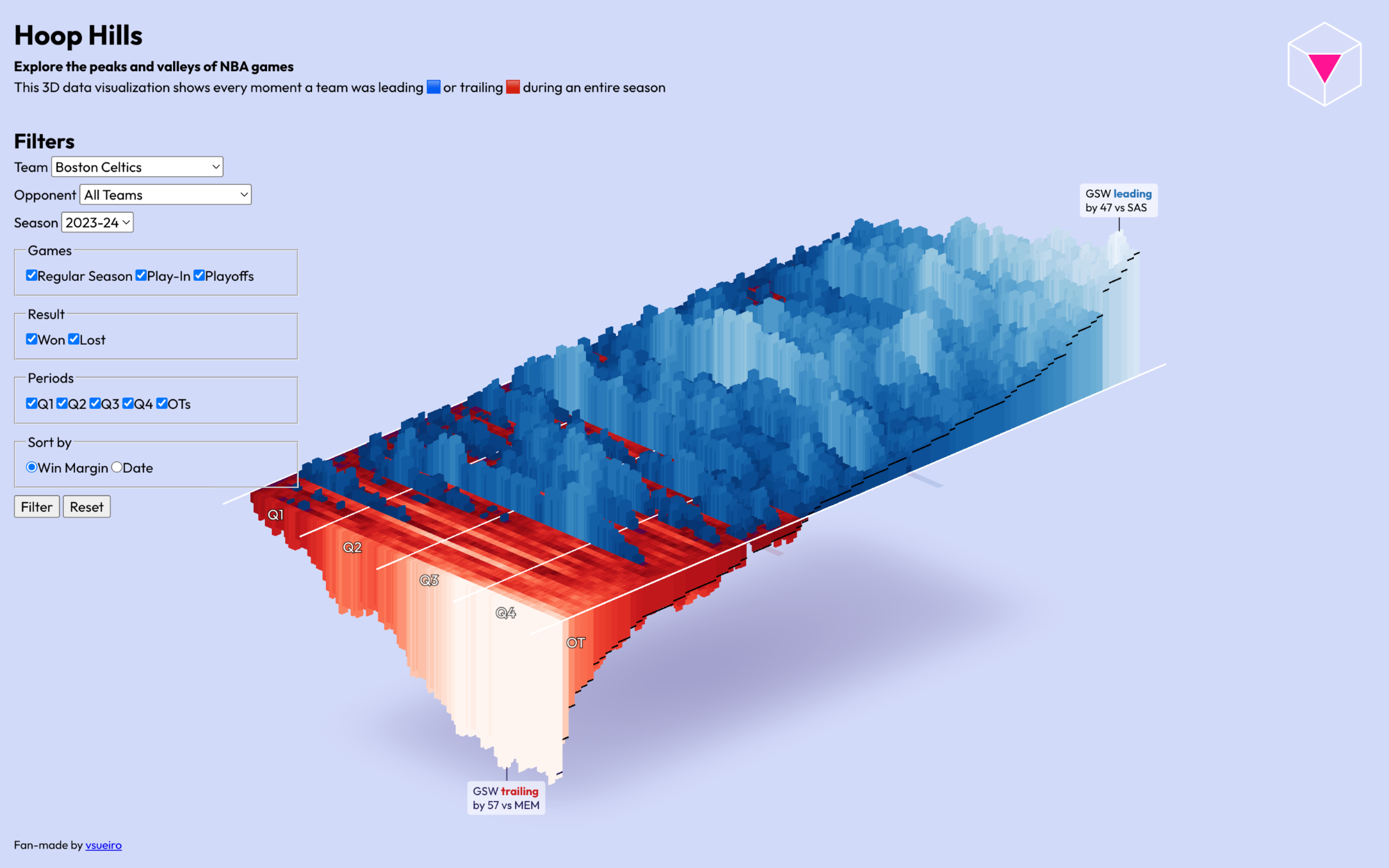
Lead Tracker for NBA games
Exploring the peaks & valleys of NBA games with a 3D chart — where each angle provides new insights
Context
When my wife an I moved to the United States, in 2022, we wanted to do things we couldn’t do in Brazil. And that included watching an NBA game in person.
To celebrate our first wedding anniversary abroad, we did just that! We watched the Miami Heat play against the Detroit Pistons.
By half time, the Heat was winning — but… they ended up losing by 22 points.
Sure, comebacks like these happen… But how often?
First, let’s take a look at what a comeback looks like.
Back then, I didn’t know a chart like this existed, but this is the NBA’s official Lead Tracker:
In this case, the red bars mean the Pistons were losing to the Heat — while the blue bars mean the Pistons were winning. The blue “mountain” on the right means the Pistons won, with a difference of 20-ish points.
That’s a good way to view the score of a game over time.
But what if we could view a team’s whole season?
Process
As you can imagine, I started sketching line charts. That should be our go-to for visualizing trends over time, right?
At first, I considered only using a snapshot of the scores by the end of each quarter, like the drawing on the left:

But why stop there? Why not visualize every time the scoreboard changed? On the rightmost sketch above, those overlapping lines are precisely that.
So, just like the official tracker, I needed play-by-play data — which is a list of everything that happened in a game, along with the exact time it happened.
A great source of NBA data is basketball-reference.com. This link will take you to that Heat game, the first one I attended. See that huge table? That’s play-by-play data.
I then wrote a Python scraper to automatically (and respectfully) extract those tables, turn them into a format I wanted, and save a beautiful .csv in my GitHub repo.
I scraped every play, by every NBA team, across all seasons since 2015. This amounts to:
- 1.6M Plays
- 30 Teams
- 10+ Seasons
That’s a lot of numbers. How should I visualize all games of a season at once? How could interactivity help people navigate all those scores?

One of my “shower ideas” was to visualize the whole thing in 3D, like a data physicalization, but virtual.
From my first coded prototypes, it was clear that, if I wanted to explore my chart in 3D without distortions due to perspective, I had to use an orthographic camera.
That camera creates “flat” views: objects far away would not seem smaller — they would be as big as closer ones. This provides a fair visual comparison, like a chart should.
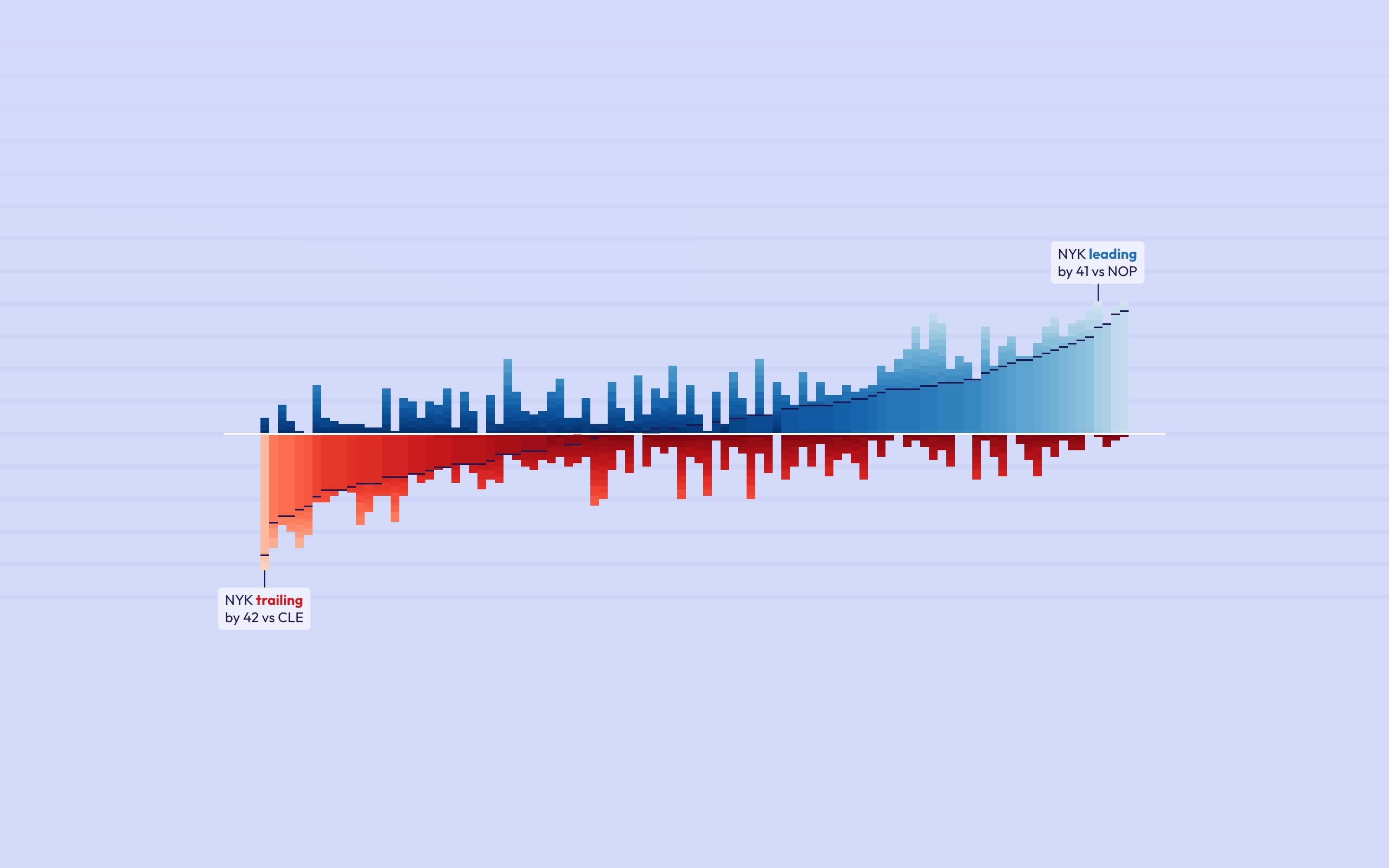
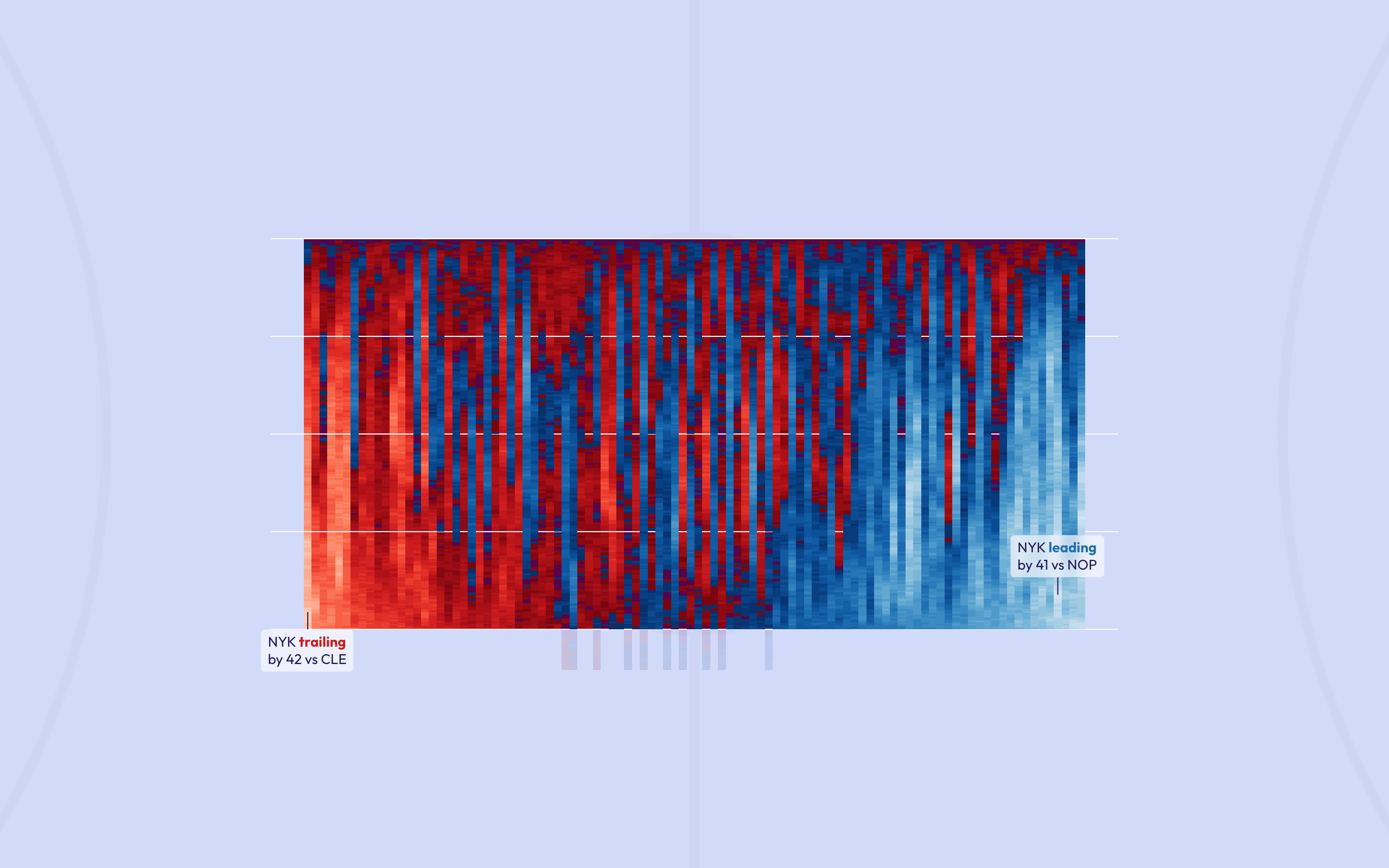
In other words, I could build a single data “sculpture”, and it could resemble 3 different charts when viewed from 3 different angles:
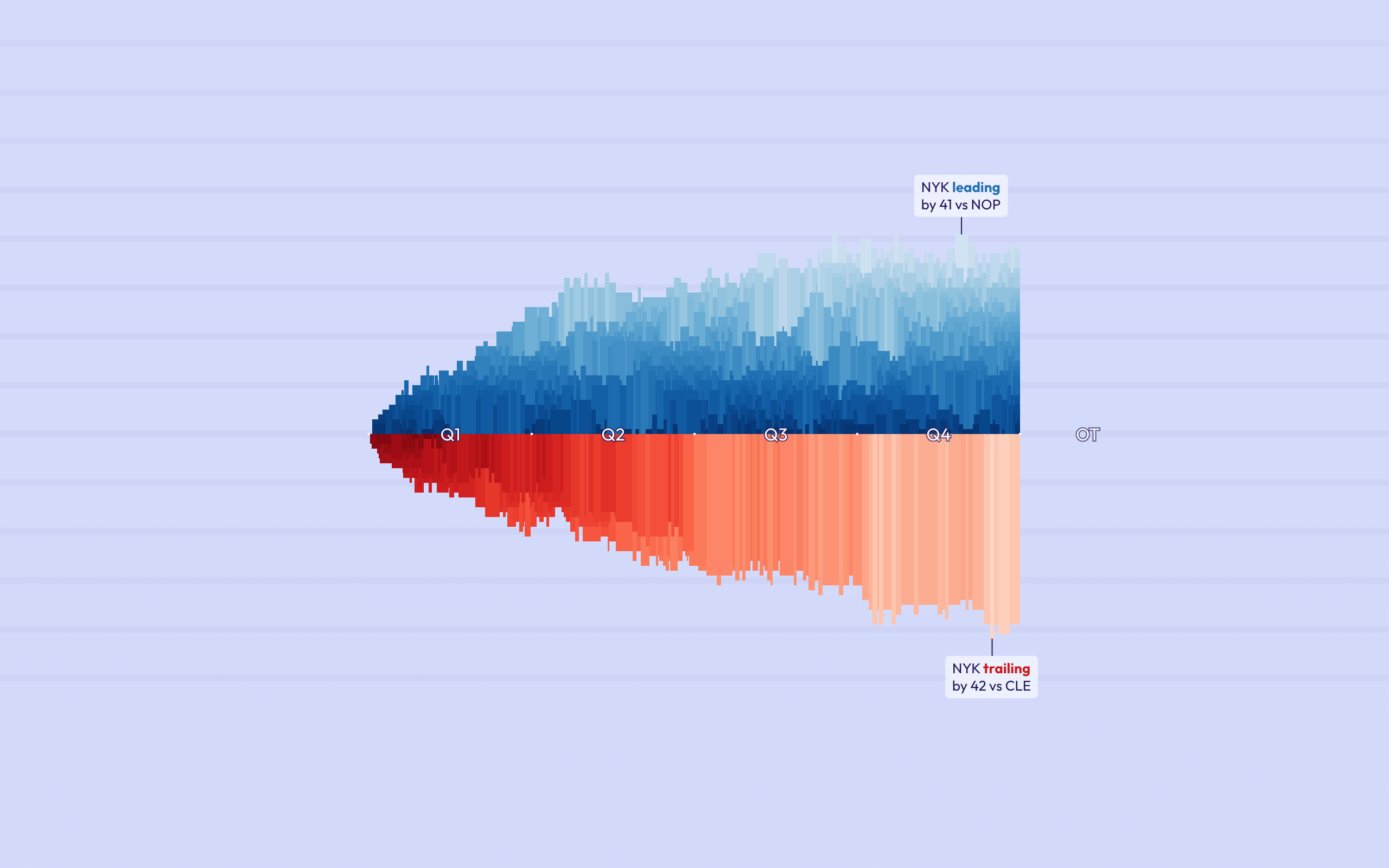
From the front, it’s looks like a line chart that shows early leads (and trails).
From one side, it’s a bar chart that shows the final point difference, and widest gaps during the game.
From the top, it’s a heat map where you can easily spot games when, say, a 4th quarter lead was blown.
To make sense and explore all those angles and insights, the visual interface went through a lot of changes.
Since I’m both a designer and developer, I often enjoy creating functional prototypes early. That’s why the first UI was basically a raw HTML form. But it gets better:
As time went by (and this was a 1+ year passion project), I kept refining the visual interface — focused on making it clearer, more consistent, and balanced.
Given the shape of the “terrain” created by those 3D bars, the corners of the screen offered the most precious real estate for interactive widgets. That’s what I embraced.
Project
In the end, I believe this project answers a simple question:
“What if could you look at your data from different angles, literally?”
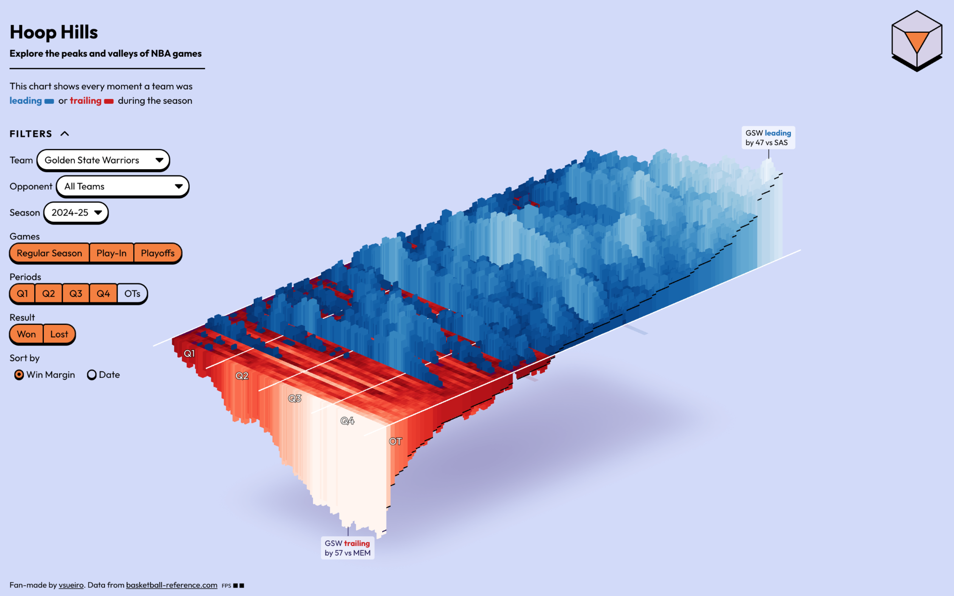
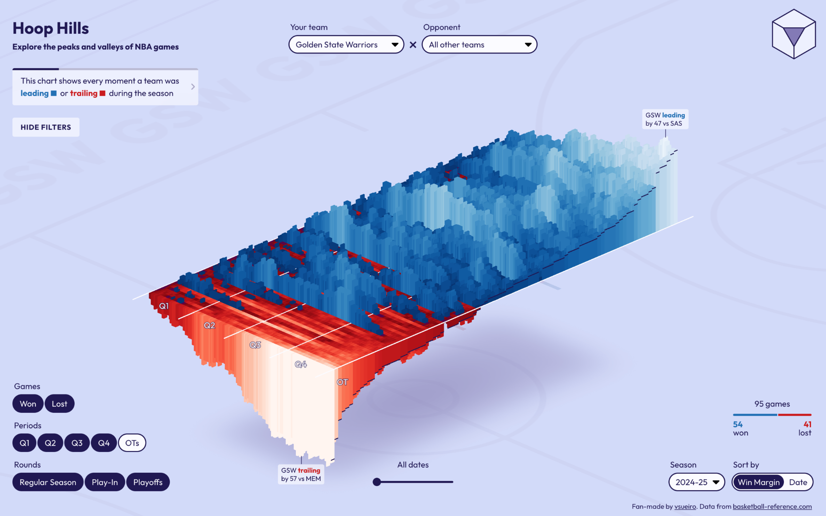
I spent over a year playing with this 3D chart for NBA data. It (ambitiously) shows every moment a team was leading (🟦) or trailing (🟥) during a season.
And that means we can visually compare teams across a whole season. The differences are especially clear when we pick teams that performed very differently:

OKC dominating, WAS losing, and MIA being mid.
But those are just a few teams I cherrypicked. Head to the Hoop Hills web app to explore the NBA on your own: